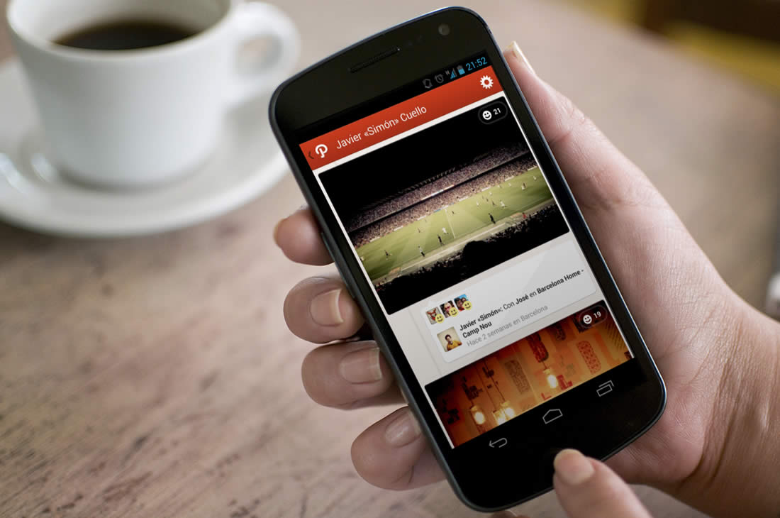
We’ve loved Path from the very start, especially its visual style and attention to detail in the interface —for example, the fact that the app’s clock moves as you scroll the timeline, a notable improvement in user experience.
We interviewed Dustin Mierau, Co-founder and Chief of Design at Path, and asked him to explain a bit more about the importance and role of these elements.
How important do you think these details are to the general design of the interface?
It’s definitely a balance. We have a lot of fun adding whimsy to our products, but we’re careful to ensure that the product focuses on being useful first, intuitive second, and compelling third. The clock helped us remove clutter from the feed allowing us to show more stories on screen at the same time: useful. Less data-like text (e.g. timestamps) made what was on screen read more intuitively. And with an analog clock we were able to add the feeling of moving backwards and forwards through time, making Path’s feed (hopefully) more compelling.
These kinds of ideas may seem difficult to transmit to teams, especially in early versions of an app, when the focus is more on functionality and less on visual elements that are often postponed.
How do you think the interaction between designers and programmers should be? Do you find it difficult to communicate concepts to developers?
Not difficult at all. There is trust between the teams at Path. More elaborate ideas need some convincing, and rightfully so, as they usually require a lot more effort and time to implement. Engineers and designers are at Path to build great products. So it’s a collaboration really, and communication is frequent. How a product works is the result of a great collaboration between engineers and designers. The more respect there is between these teams the better the resulting product will work. You can usually sense a team’s friction through their product.
Balancing the work of creating an interface with a well-finished appearance and developing a solid base that ensures an app’s correct functioning can be tough, but they’re not mutually exclusive.
Now that Path is becoming more complex, is it difficult to maintain functionality without sacrificing the user experience and vice versa?
It’s true that Path has much more functionality now than it did two years ago. I think we’re considerate of every piece of functionality we add to our products. There is much we haven’t added because we haven’t found a good way to incorporate it. A lot of functionality doesn’t mean much if you can’t figure out how to use it.
We put a great deal of effort into finding the right way to add features to a product. Features are added such that they work well on their own and, when combined with other product features, create an experience that is compelling, useful, and intuitive.
After its apps for iPhone and Android, Path launched an iPad version that, in comparison with the others, is relatively new and is on its way of defining its own personality.
The Path app for iPad has recycled some of the design patterns that were already present for iPhone, but others are new. What are the benefits of having so much space to play with?
It’s not just more space we have to play with, it’s an entirely different use case. When using Path on your iPhone or iPod Touch, you are most likely busy, at work, on a trip, outside, with friends, etc. When you’re on your iPad, you’re at home, at a cafe, at work, and probably sitting. Yes, you’re in a better place to consume more and probably have time to interact more, but the type of content you’re prepared to create is unique. With the iPad you’re ready to share a collection of photos, write deeper thoughts, take time to edit videos, and simply be more creative.
We really haven’t scratched the surface of what Path on iPad can be. I think the team is looking forward to taking advantage of the real estate the device offers to allow Path users to be much more creative with how they share their lives.
Without a doubt, this app is a good reference for designers and developers, who can use it as a solid example of how to make a high-quality product without neglecting function or design. This is hard to achieve for many designers, especially when a project is just starting out and the road ahead is unclear.
We asked Dustin for some advice for new app designers who may be lost in the myriad of applications and operating systems out there:
Figure out a utility, strip away the nonsense, and make it yours. Absorb as much technical knowledge as you can. Be humble. Be curious. Respect engineers. Respect your users.