Simple is a money management system based entirely on a digital platform. Not a physical bank, it solves what could be highly complex through an experience that is, in fact, simple. And because it’s a service that is used entirely on the internet, its application is of the utmost importance.
Dustin Barker, Mobile Engineering Director at Simple, is in charge of developing an app that, besides having a spectacular user experience, fosters so much confidence that the platform’s security is never in doubt.
How do you manage to make users feel safe and confident when using the Simple app?
Since the mechanics of how we secure our customers’ data are not visible, the feeling of security has to come from the interaction. We go above and beyond in securing our mobile apps, but often it’s the details unrelated to security that provide users with a sense of safety.
We look to establish trust through quality. A responsive, stable app is essential to a feeling of security since it reassures the user that the engineering team is mindful with details. A high quality exterior gives the user a basis to assume a high quality (and therefore) secure interior.
In addition to establishing trust through quality, we spend a lot of time designing the security mechanisms that the user can see. Features like multifactor authentication, which we use for sending payments, are essential to not only securing the interaction, but establishing trust and a sense of safety for our customers while they are using Simple.
Dustin was also the ideologist of the mobile first way of working, which privileges mobile design before a desktop website is created. Even though this methodology is booming today, it has still failed to demonstrate clear advantages in comparison to the traditional process.
When you look back, what do you think are the most important benefits of this way of working?
Our focus on Mobile gives us constraints to work within and helps us make decisions. Parameters like screen-size, battery life, and network connectivity force us to pare down features to only the essentials.
Mobile apps are used in distracting environments —like waiting in a line or during a conversation— so we use this knowledge to make decisions about how we can make every interaction as efficient and informative as possible.
When we think about a feature, we don’t limit our thinking to just what transpires between the screen and the user, but where the user might be located, what they might doing while they interact with the app, what their needs are in different contexts. These considerations help us discover details about a feature that might have otherwise been overlooked.
What’s next after the iPhone app? An Android version, of course. Dustin told us what he learned from the experience of designing first for iOS and then for Android and targeting a different kind of user:
One of our primary goals in building Simple for iPhone was to make all interactions as intuitive as possible. In order to achieve that, we relied heavily on iOS idioms that we knew our users would be familiar with. In order to achieve that same goal on Android, we couldn’t use those same iOS idioms. We had to start from scratch. We re-imagined the Simple app using only Android architecture and the result is an app that is consistent with our brand and offers a unique Android experience.

In the first releases of Simple for iPhone, we learned how to streamline and simplify each feature. We also learned which aspects of the app were particularly tricky or prone to error. While the design for the Android app was completely new, we were able to begin building exactly where Simple for iPhone left off.
Since the launch of Simple for Android, engineering decisions we’ve made in the Android have also been carried back to our iOS app. For instance, we knew that the category list in earlier versions of our iPhone app was less than optimal. We debuted a new category list design in the first release of our Android app and once we saw that it was successful, we quickly ported it back to the iOS app. Our users have been thrilled with the result.
Now, we’re in a position to let our experiences on both platforms cross-pollinate and we’re able to try different things on each to explore what works best.
Besides mobile apps, there is also the web. In the realm of money management services, some operations can be difficult to complete from a mobile screen and are best left for desktop computers.
How do you choose which features it makes sense to have in a mobile device?
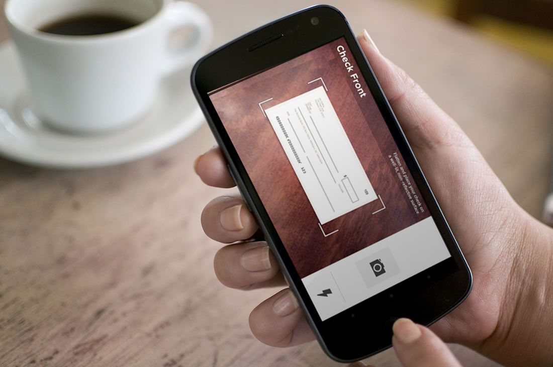
Simple’s features can be divided into functions for controlling (send a payment, transfer money, deposit a check, etc.) and analyzing (reports, statements) finances. We’ve focused our mobile app on the functions for controlling finances. These are the functions that our customers need on the go. You can read a bill, grab your phone, open Simple, and send a payment in seconds with just a few taps. Functions for analyzing finances might find their way into our mobile app eventually, but when they do we’ll still look for ways to optimize these interactions.
Simple apps serve as great inspiration for designers and developers who dream of a product with a clean visual appearance, without disregarding functional or business aspects. Contrary to how it may seem, achieving this is not impossible. Dustin revealed his work process:
The key for Simple has been to continuously evolve our design as each feature is built. We never stop designing the interface and we never hesitate to revisit these decisions, even very late in the process of building a feature.
We begin each feature with a design phase, during which engineers provide both technical and aesthetic feedback as the designers iterate. Once we have a solid vision, we begin building, but we know the design phase is not yet complete. As we build, we discover how a design ‘feels’ on a touch screen and this leads to new ideas about how the feature should look and behave. In order to get constant feedback on our progress, we ship a new build to all employees every night.
We’re always looking for ways to improve each feature and we never regard any one feature as ‘complete’. This process is only possible because our engineers and designers work very closely and collaborate constantly.